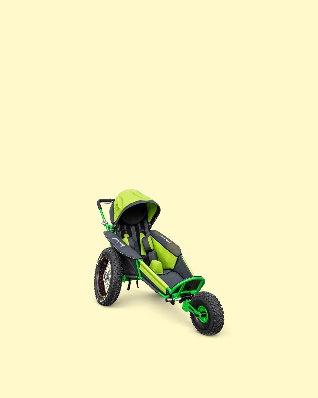
xRover
Choose.Compare.Get outside.
- Client
- Volter s.r.o.
- What we made
- UX & UI · Custom development · Scroll animation · Commerce & integrations
- Languages
- Czech · English · German
A good first impression. And then?
A website that knows the next step.
Catching someone’s attention is just the start. The xRover website then helps them choose a stroller, compare equipment and arrange a first ride. We connected those steps so interest can turn into a clear decision.
The moment a card breaks loose
Click. And suddenly you’re inside.

 yes, a product can have its own scene.
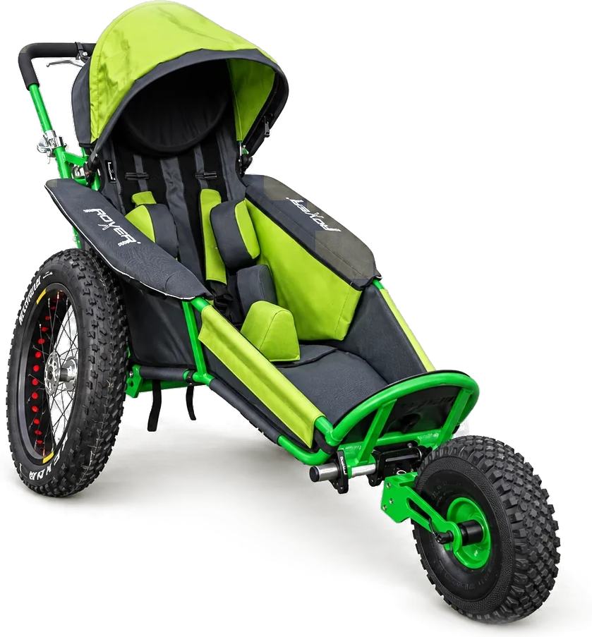
Hotboots begins as a card on the homepage. Opening it fills the screen and leads into a dedicated product gallery. Motion connects the overview to the detail, graphics explain the features, and contact stays within reach.


Hotboots.
A product with a scene of its own.


Three screens
What this website does.
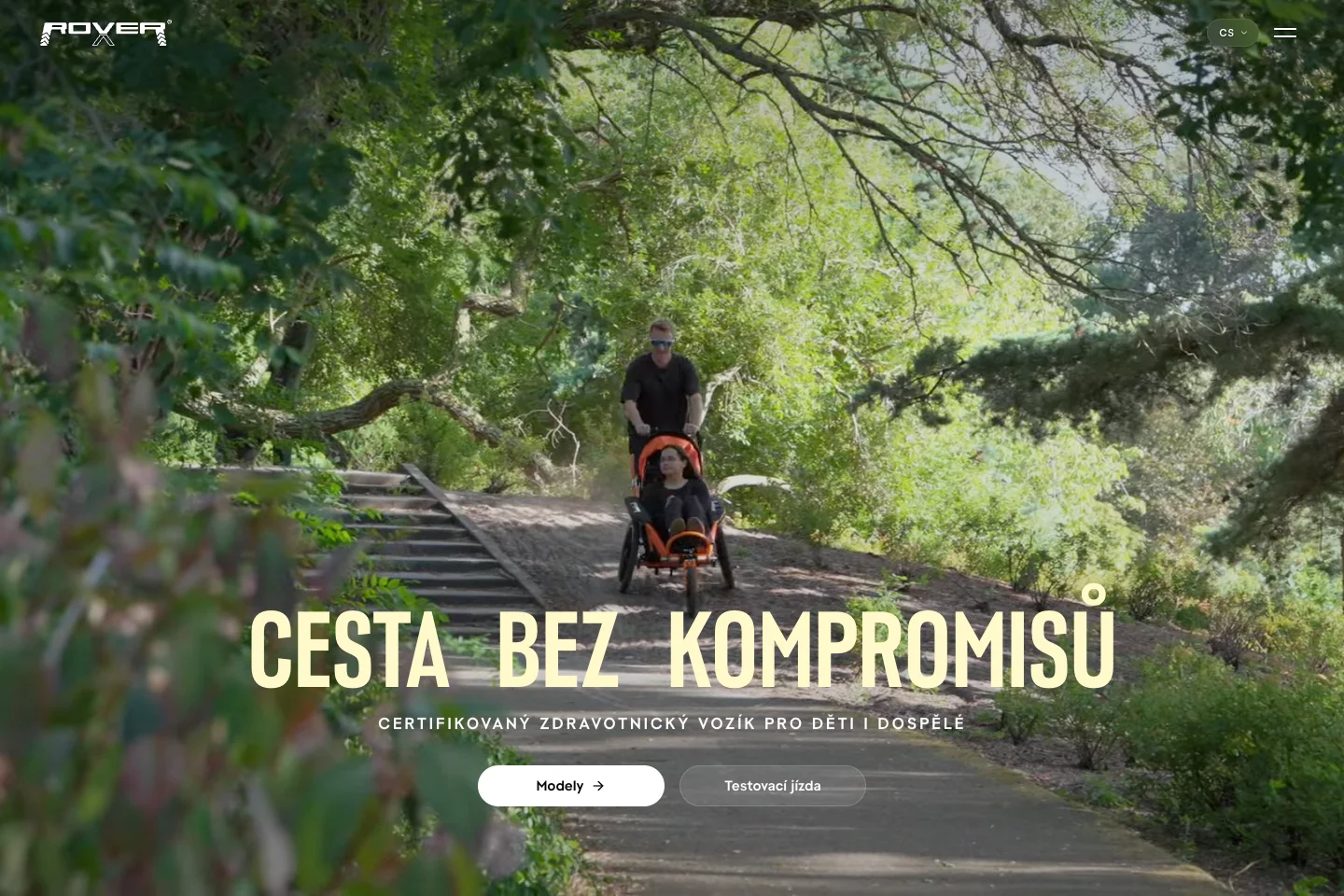 The homepage
Choose. Compare. Get outside.
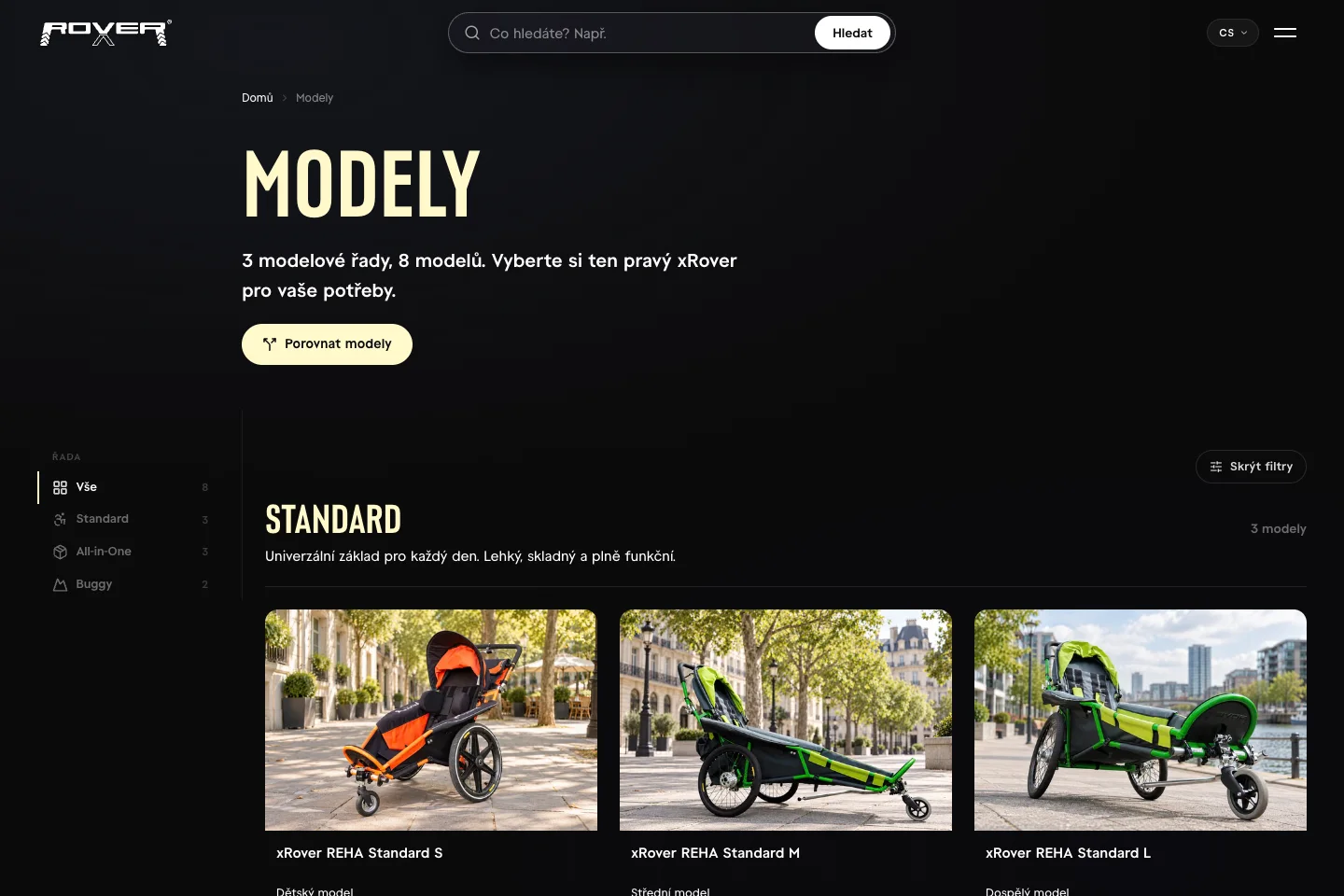 01 Find a model
Eight options. A clear direction.
The catalogue organises strollers by model range and size. Visitors can narrow their selection, explore colours and open the details of a specific model.
Model ranges · sizes · colour options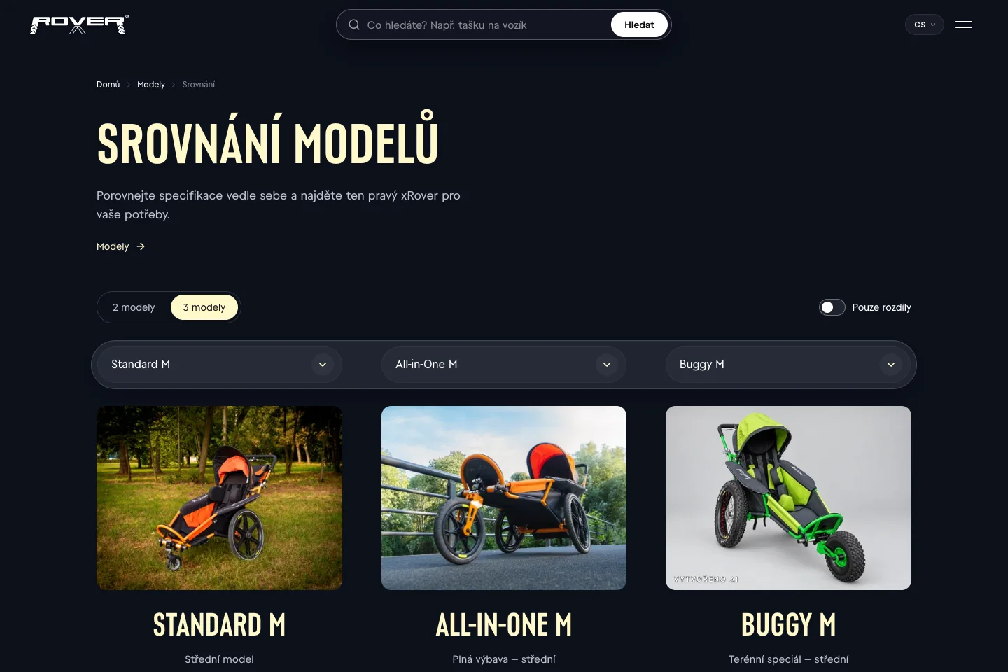
The comparison. Two or three strollers side by side. 02 Make a decisionThe differences. Side by side.
Two or three strollers in one view. The comparison brings dimensions, capacity and equipment together. A differences-only switch helps visitors focus on what matters for their choice.
Model comparison · specifications · differences only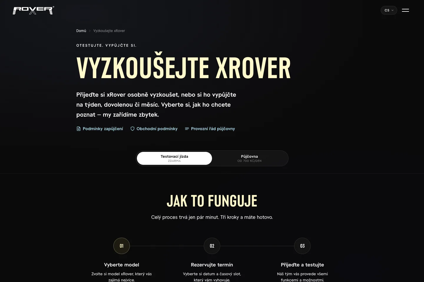
Test ride. Model, date, ride. 03 Try it in personFrom a website to a test ride.
Test rides and rentals have a clear path: choose a model, pick a date and share the necessary details. A separate accessories shop takes over where the standard equipment ends.
Bookings · rentals · accessories · shopping journey


and in your pocket.


And also
And that’s not all.


ePower as a film.
On the homepage, the ePower drive plays as a film you steer by scrolling: detail after detail, forwards and back.
How it came about
Built around a decision.
- 01
A brief in one sentence.
A website that moves and tells a proper story. xRover didn’t need to say more; the rest was up to us.
- 02
Two worlds under one roof.
On one side trips, families and fresh air; on the other a medical device with its technical data. We joined them so that even a lot of content reads lightly.
- 03
Then came the workshop.
Once the story worked, we connected the shop to Shopify and the other systems. The show on top, honest work underneath.
Good on the outside. Connected underneath.
plenty happening under the hood.
What we built
- From a first impression to a decision
Models, sizes, colours and a comparison in one path.
- Commerce that follows through
A custom frontend on Shopify, with a customer account.
- A date in the calendar
Test rides and rentals through Microsoft Bookings.
- Their content. Our choreography.
Sanity in three languages, and Hotboots with its own direction.
What it runs on
 Next.jsCustom frontend
 ShopifyHeadless commerce
 SanityContent management
 VercelDeployment & hosting
 Microsoft GraphBooking integration
 GSAP & MotionMotion direction
Under the hood
You can’t see it. It’s there.
Two people, one slot? Not happening.
If two people book the same ride at the same moment, the earlier booking stands and the other cancels itself.
A comparison that shows the difference.
Up to three models side by side, and one switch hides everything they share. What’s left is only where they really differ.
A film that keeps up with a fast scroll.
The ePower frames are prepared ahead in the direction you’re scrolling, and the distant ones are let go. The film keeps pace even when you fling the page back and forth, without flooding a phone’s memory.
Looks good. Does the work.
One website, from the first impression through comparison to bookings and accessories. Each part has its own character. Every part leads somewhere.
 good cause. good website.
